If there's a personality trait every baseball fan should possess it has to be dynamism. Accepting the possibility of the 2020 baseball season never even beginning is sobering and I'm searching for coping mechanisms other than reminiscing on all the other times fans have been let down when it comes to the one-sided obsession we have with this game.
Besides the strike-shortened season of 1994, I'm fortunate that the only adjustment I've had to make was the prior year. My hometown team, the Tidewater Tides, dropped the alliteration in their catchy team name in favor of acknowledging the City of Norfolk, which in all fairness was an overdue gesture as Norfolk had been hosting the team since 1969.
The name change seemed like a big deal at the time but maybe that's because it also came with a change of scenery as the Tides left their well-worn environs of Metropolitan Park and moved into brand new digs. Harbor Park still stands as home to the Tides currently and is every bit as lovely today as it was over 25 years ago.
In terms of uniform changes, the move ushered in a colorway shift from blue, orange and white hats to the more understated royal, powder blue and white design, which I'm only now realizing I haven't written about yet. I promise to rectify this oversight shortly.
Of course, fans in some cities are put through more difficult tests of faith than others but whether a club undergoes a simple team name rebrand, affiliation switch or in extreme cases, a relocation, fans have always rolled with the punch. All things considered, what I experienced is nothing to what trouble folks have endured in Utica, NY.
The outlook seemed dire for Utica when that article was written in 2010 however three years later the American Hockey League welcomed the Utica Comets and the team has continued to do well up until now, disregarding the fact that their 2019-20 season has been postponed due to the current coronavirus-pandemic.
Back to baseball though, as someone who got into MILB card collecting in the early 1990's, the Utica Blue Sox seemed like an anomaly to me because it made little sense that their cap and uniforms were identical to the ones worn by their parent team, the Chicago White Sox. In my mind, their hats should have been some shade of blue rather than black.
It wasn't until I got my hands on older cards when I realized that for a very brief period, they had a blue cap but one whose logo was clean and simple, yet distinctive and unique enough to rock my world. Behold, the Utica Blue Sox cap worn from 1988 through 1990.
This one is not going on the Trading Block however please don't hesitate to reach out if you want any other cap from that list and you are willing to part with any of the hats on my Wish List.
As always, thanks for coming back to read about baseball hat geekery. I've got comments disabled here so if you'd like to discuss a trade or simply just chat about hats, please feel free to connect via the following social sites:
Besides the strike-shortened season of 1994, I'm fortunate that the only adjustment I've had to make was the prior year. My hometown team, the Tidewater Tides, dropped the alliteration in their catchy team name in favor of acknowledging the City of Norfolk, which in all fairness was an overdue gesture as Norfolk had been hosting the team since 1969.
The name change seemed like a big deal at the time but maybe that's because it also came with a change of scenery as the Tides left their well-worn environs of Metropolitan Park and moved into brand new digs. Harbor Park still stands as home to the Tides currently and is every bit as lovely today as it was over 25 years ago.
In terms of uniform changes, the move ushered in a colorway shift from blue, orange and white hats to the more understated royal, powder blue and white design, which I'm only now realizing I haven't written about yet. I promise to rectify this oversight shortly.
Of course, fans in some cities are put through more difficult tests of faith than others but whether a club undergoes a simple team name rebrand, affiliation switch or in extreme cases, a relocation, fans have always rolled with the punch. All things considered, what I experienced is nothing to what trouble folks have endured in Utica, NY.
The outlook seemed dire for Utica when that article was written in 2010 however three years later the American Hockey League welcomed the Utica Comets and the team has continued to do well up until now, disregarding the fact that their 2019-20 season has been postponed due to the current coronavirus-pandemic.
Back to baseball though, as someone who got into MILB card collecting in the early 1990's, the Utica Blue Sox seemed like an anomaly to me because it made little sense that their cap and uniforms were identical to the ones worn by their parent team, the Chicago White Sox. In my mind, their hats should have been some shade of blue rather than black.
It wasn't until I got my hands on older cards when I realized that for a very brief period, they had a blue cap but one whose logo was clean and simple, yet distinctive and unique enough to rock my world. Behold, the Utica Blue Sox cap worn from 1988 through 1990.
 |
| I'm not sure who pitched the idea for this cap but they're a complete genius in my book. To modify the "C" from that era's Chicago White Sox cap logo to become a "U" is so out of left field, it's impossible not to love it. |
 |
| If the Blue Sox ever wore a fitted version of this cap but if they did I want one in my size but until then I'm totally content with this snapback. |
 |
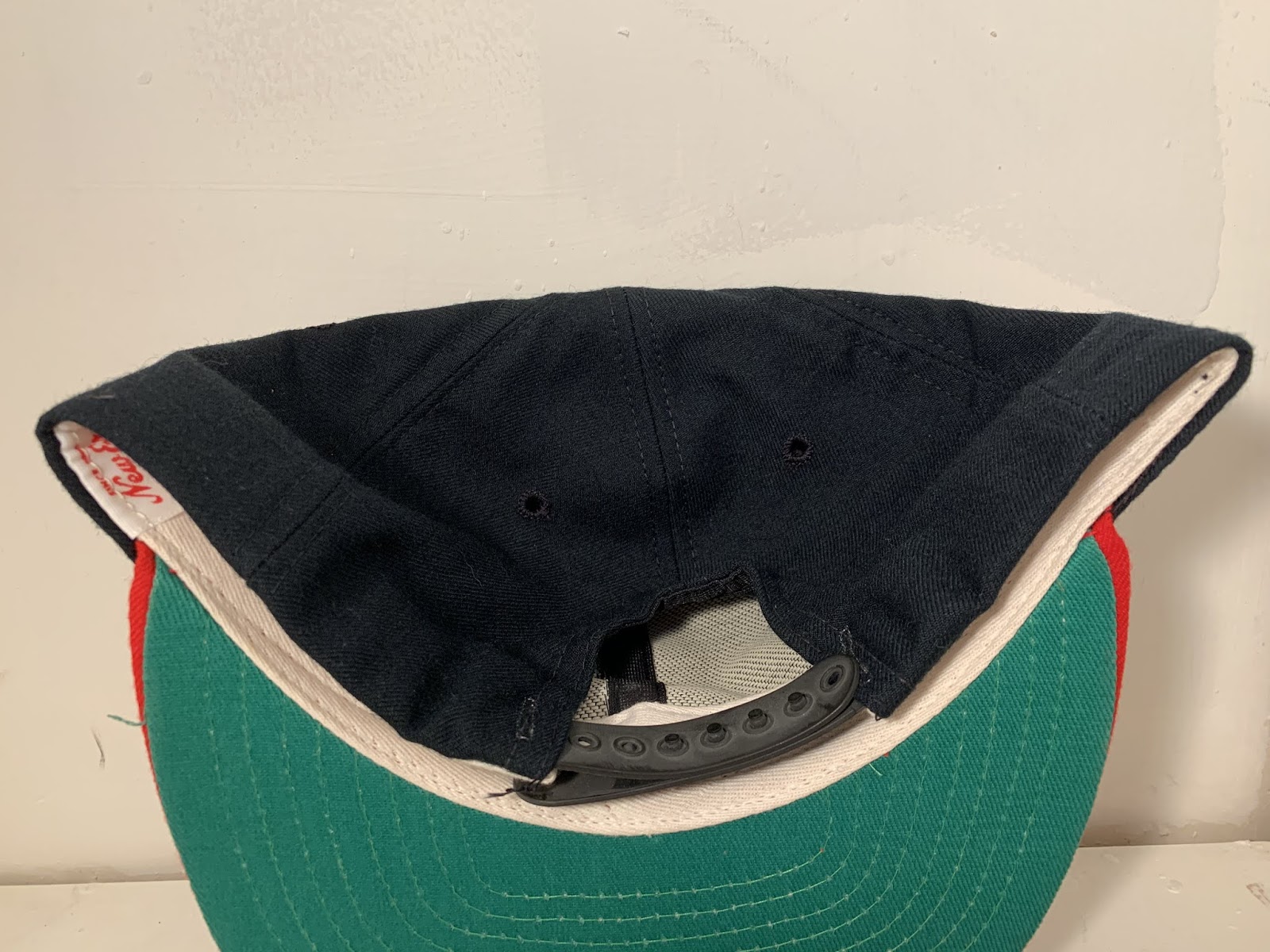
| Not much in the way of sweatband tags and that's just the way i like it with caps from this time period. |
This one is not going on the Trading Block however please don't hesitate to reach out if you want any other cap from that list and you are willing to part with any of the hats on my Wish List.

As always, thanks for coming back to read about baseball hat geekery. I've got comments disabled here so if you'd like to discuss a trade or simply just chat about hats, please feel free to connect via the following social sites:
Instagram: @baseballmilquetoast
Twitter: @FittedFriday

Comments